Students Illustrate Transit Etiquette in New TransLink Collaboration

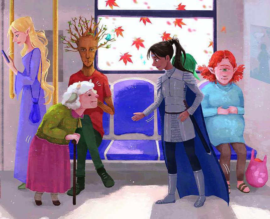
A detail from artist and ECU student Kristen Chow's illustration for a TransLink etiquette campaign. (Image courtesy Kristen Chow)
Posted on | Updated
Students in artist and faculty member Justin Novak’s illustration course created artwork for the regional transportation authority to help encourage a more respectful transit ridership.
Students in artist and ECU faculty member Justin Novak’s third-year illustration course recently created transit etiquette illustrations for Metro Vancouver’s regional transportation authority TransLink.
The collaboration put students into a professional, working relationship with the transit authority. Students had the chance to submit work for selection and hear from TransLink about their processes for choosing winning illustrations.
“The students are ‘competing’ with one another, in a sense, for the opportunity to have their work on TransLink and to be compensated for it as well. But the learning experience is primary — the educational value of having visitors from TransLink come to the classroom to share their insight into how the creative department and bureaucracy of the company operate,” Justin tells me via video chat.
“It’s a revealing window into the complexities of that process. Students truly gain an understanding that it’s not about rejecting weak work and accepting strong work. There are a range of nuances that determine which artist might be the right fit at any given time.”
This year marks the second time Justin’s illustration students have worked with TransLink on an etiquette campaign.
“Transit etiquette is a really important topic, and it’s hard to strike the right balance in tone between clearly expressing an expectation and engaging people to actually want to do it,” says Debra Rolfe, TransLink’s senior planner of public art and Indigenous cultural recognition. “The students seem to figure this out effortlessly, and their work is full of brightness and humour. I appreciate being able to nurture the careers of emerging artists — doing this feels like doing our part to invest in the future of public art.”

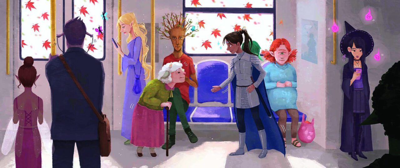
Artist and ECU student Kristen Chow's illustration for a TransLink etiquette campaign. (Image courtesy Kristen Chow)
For Justin, such collaborations also give students the chance to explore how their work can engage with the broader social issues of the day. With the etiquette campaign, one of those issues is how best to inspire compassion and respect among strangers.
“There’s been a strong focus recently on how compliance culture is less effective than a community based on shared responsibility. That’s the spirit and discourse we brought to the project,” he says. “And even though this messaging is not about mask-wearing, it comes at a time when there has clearly been a lot of heightened societal tension around being told what to do. We tried to examine that facet of the cultural ethos of the moment.”
One of Justin’s students, Kristen Chow, submitted a winning illustration for the message, “Please give up priority seats to those who need them.” Kristen used characters from the world of fairy tales and fantasy to communicate her ideas.
Kristen tells me it was eye-opening to learn how much revision and consensus clients such as TransLink go through to green-light a final product. Once she’d got a handle on those complexities, Kristen drew on her personal experience for inspiration.
“I’m from Richmond, so I mainly ride the Canada Line. It’s always so nice when the train exits the tunnel and fills with sunlight,” she says. “I chose the fantasy theme because I love designing characters, and I thought it would be a nice way to show diversity. Bringing in magical elements also gave me a bit more freedom with skin tones, silhouettes, and fashion. The fantasy focus led me to the knight character, aligning well with the chivalrous nature of offering up a seat, bringing me to the final concept. Of course, I also had to give a shoutout to Canada with maple leaves, and I think they totally enhance the vibes!”

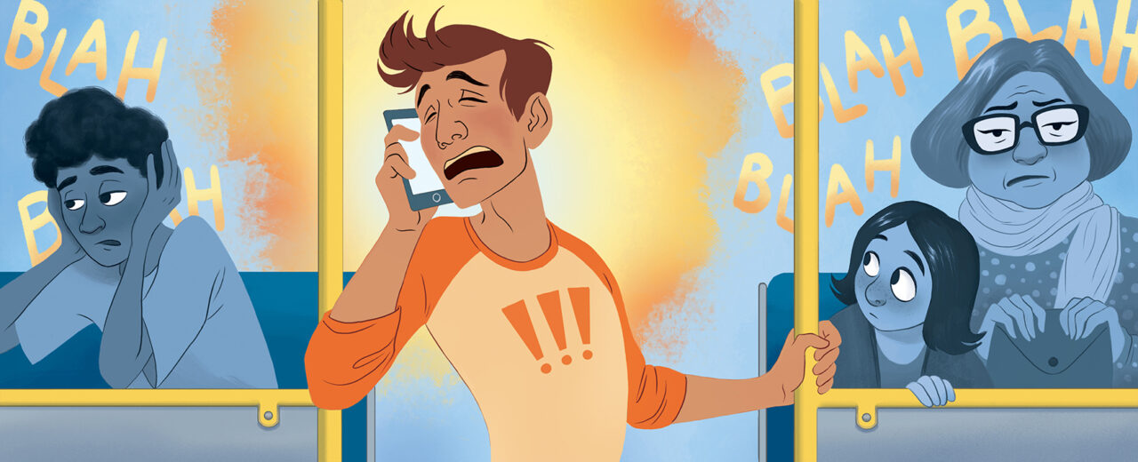
Artist and ECU student Amy Longo's illustration for a TransLink etiquette campaign. (Image courtesy Amy Longo)
Another of Justin’s students, Amy Longo, illustrated the message, “Avoid loud phone conversations and music.” Like Kristen, Amy drew on past encounters on public transit to bring her theme to life.
“I was inspired by a couple of my own experiences riding the bus with very enthusiastic, theatrical passengers,” she tells me via email. Establishing a balance between personal style, appropriate tone and TransLink’s specific needs was one challenge Amy enjoyed.
“People dislike feeling like they’re being forced to behave, so we had to learn a bit more about the psychology of public messaging,” she continues. But the feedback she received throughout the process was invaluable.
“Being able to discuss the work in class and get feedback was great. Each illustration is meant for the wide variety of people using public transit, so it’s important to get other people’s eyes on it as early as possible, to make sure it communicates clearly. There was helpful critique from fellow students, the professor, and TransLink employees.”
Justin notes that observing his students' processes is one of the great joys of instruction.
“It’s always intriguing to see how students negotiate a very pragmatic assignment of this kind which, on a poetic level, is simply an encouragement of riders to show respect for their community,” he says. “It requires an adaptability and ingenuity of them that can be quite a revelatory exercise for themselves as well. As an educator, it’s exciting to bring these collaborations into the institution so students gain perspective on the world they’ll be entering as professional artists.”

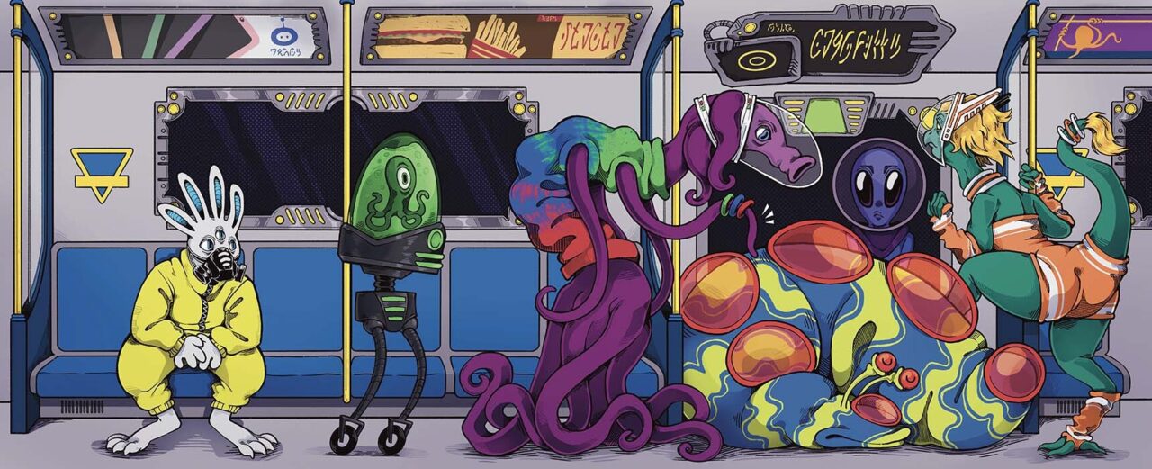
Artist and ECU student Ash Contois's illustration for a TransLink etiquette campaign. (Image courtesy Ash Contois)
Check out Amy Longo on Behance and Kristen Chow on Instagram to see more of their work. Visit Justin Novak’s website to learn more about his practice.
Visit TransLink online to find out about its many ongoing public art projects.
--
Learn more about studying Illustration at Emily Carr at ecuad.ca.